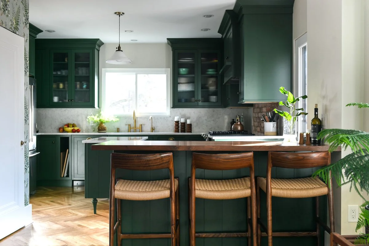
Going Green
From a ‘no fun” kitchen to a lovely place to linger, this space was transformed by A. Shapiro Design and Marino Kitchen & Bath.
Photography by Erin Kelly.
This article appears in the Spring 2022 issue of Pittsburgh’s Finest Kitchens. Visit Don’s Appliances showrooms for a copy or buy one here.
“It was a no-fun kitchen.”
That’s how the owners of this Highland Park home described their space before the team of Alison Shapiro, owner of A. Shapiro Design, and Amanda Johnson, general contractor and project manager with Marino Kitchen & Bath, got their hands on it.
No longer. This renovation is effortlessly unique, joyful, and welcoming.
Shapiro, an interior design and remodeling specialist, recalls, “[The homeowners] had a very clear vision of what they wanted.” They brought her images of bespoke French kitchens and farmhouse-style cottages to the table. “They wanted my help to educate them on how to accomplish that visual. It was a creative problem-solving process for all of us.”
Counter stools by J.L. Møllers bring the warm glow of wood to this green kitchen..
Step one: removing the wall between the kitchen and dining room. This freed up the previously cramped area and invited flow. To create a transitional moment, Shapiro inserted a walnut-topped bar. Complete with three J.L. Møllers stools, it is now the homeowners’ favorite place in the house.
The kitchen’s U-shape means “it’s really tight in the two corners,” say Shapiro. Working with custom cabinetry allowed the team to get it just right, with much fine-tuning in the process. In the end, some spaces were simply too small for cabinets and doors. Instead, the designer created “little custom moments that are utilitarian but also look good and are personal,” like mini shelves displaying the spines of colorful cookbooks, and an easily accessible nook used for storing cutting boards.
Thoughtful details continue in the antique brass hardware and reeded glass on select cabinets. The original exposed brick chimney pairs perfectly with the intentionally simple backsplash. “I treated it as a way to smooth out the horizon line in the kitchen and create a moment of rest for your eyes,” says Shapiro.
The cabinets feature a custom paint color, the appropriately named Sherwin-Williams Vogue Green. “This project was so fun because they were willing to take a risk, and this color was special,” says Johnson. “Green is everywhere in nature, so it’s one of the few colors that stays classic.” And, it beautifully complements the plant collection throughout.
Wallpaper adds zest to the design, as do touches of exposed brick and glass-front cabinets.
Some might also consider bold wallpaper a risk, but -- as one of the homeowners’ main sources of inspiration—it majorly paid off. The print chosen for the kitchen “is not a William Morris wallpaper, but it’s very much in the style,” says Shapiro. (British Victorian-era Morris designed over 50 papers and was known for exacting patterns drawn from nature.) She notes that the large repeat and the color density “take you back to these different eras and moments that are appropriate to the architecture in this turn-of-the-century home.”
The space functions with an efficiency matched by its attractiveness.
Shapiro’s biggest aha moment was finding a way to blend existing hardwood with a new floor. While the team was able to source the same species of white oak, it would be impossible to create a perfectly seamless match. The solution? Laying the floor in a herringbone pattern.
The resulting room, from top to bottom, is perfection.
Appliance list by DON’S APPLIANCES
Bosch 800 Series Dishwasher
Faber Inca Lux Custom Insert Range Hood
Maytag Fingerprint Resistant Stainless Steel French Door Refrigerator
Samsung Smart Slide-In Gas Range with Smart Dial & Air Fry
STORY BY NICOLE BARLEY / PHOTOGRAPHY BY ERIN KELLY
12 Month - 6 issue subscription


Indulge in the taste spring with this delicious Cherry Galette